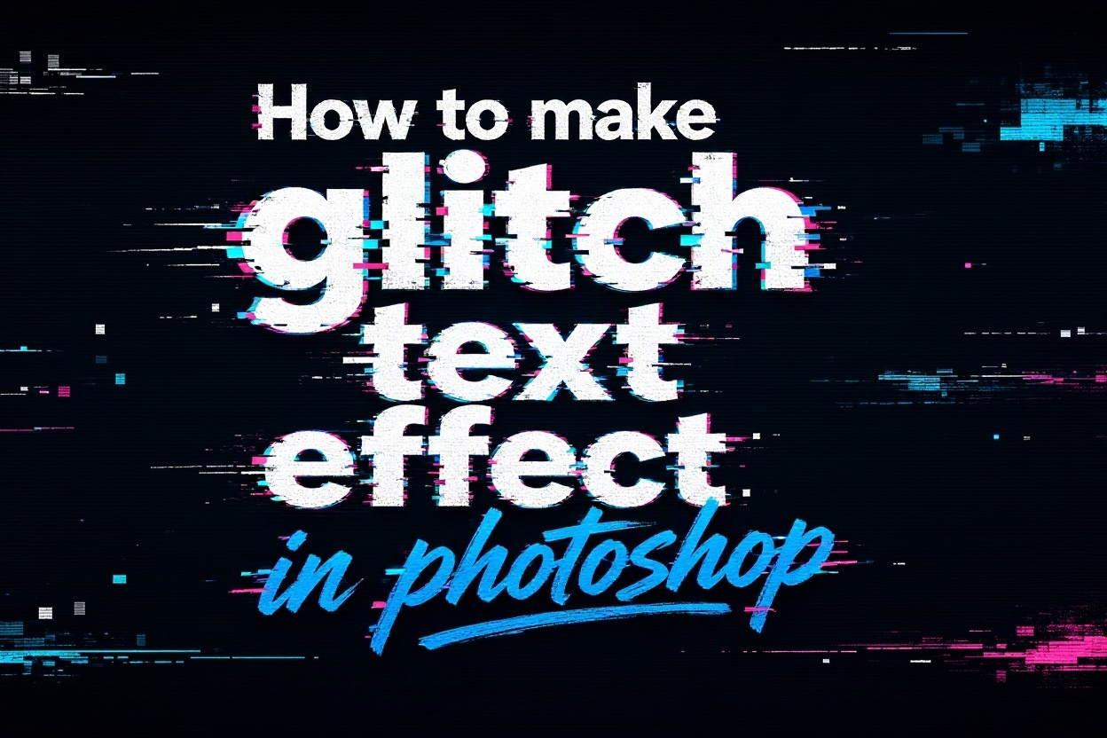
A glitch text effect can turn ordinary typography into something energetic, digital, and attention-grabbing. If you want to learn how to make glitch text effect in Photoshop, you can create the look with a few editable layers, blending modes, selections, and distortion tools. The effect works especially well for music artwork, gaming graphics, technology posts, posters, thumbnails, and social media designs.
The best glitch effects combine controlled distortion with strong contrast. Random noise alone usually looks unfinished, while carefully separated color channels, offset fragments, scan lines, and small imperfections create a more convincing digital breakdown. Photoshop gives you enough control to build the effect from scratch and adjust every part later.
In this guide, you will learn how to prepare your document, create the main text, split colors, add distortion, produce horizontal breaks, improve realism, and export the finished design. You will also discover common mistakes, practical use cases, advanced tips, and answers to frequent questions about creating glitch typography in Photoshop.
A glitch text effect imitates the visual errors associated with damaged digital signals, corrupted files, unstable screens, or interrupted video data. Typical features include duplicated letters, broken horizontal strips, red and cyan color offsets, uneven spacing, scan lines, noise, and sharp pixel-like distortions. The design should feel intentional even when it appears chaotic.
This style is popular because it communicates movement and modern digital culture immediately. A clean word can become more expressive when parts of it appear displaced or split apart. The effect may suggest speed, technology, rebellion, cyberpunk aesthetics, virtual reality, music, gaming, or experimental design, depending on the colors, typeface, and amount of distortion.
Before starting, choose a short word or phrase with a bold, readable font. Heavy sans-serif typefaces usually provide enough surface area for color separation and fragmented sections. Very thin fonts can disappear when sliced, offset, or covered with noise. A large canvas also gives you more room to refine the effect without making the details look cramped.
Keep the text editable for as long as possible. Duplicate the text layer before rasterizing or converting it into a smart object, and name the layers clearly. This makes it easier to change the wording, test different colors, or reduce the intensity of the distortion after seeing the complete composition.
A successful result is not measured by how many effects you apply. The strongest glitch typography usually has a clear primary word, a limited color palette, and a few areas of controlled disruption. Preserve enough of the original letterforms for viewers to read the message quickly.
How Do You Set Up Glitch Text In Photoshop?
1. Create A Suitable Photoshop Document
Open Photoshop and create a document appropriate for the final use. A square canvas works well for social media, while a wide document suits banners or video titles. Use a moderately high resolution, choose RGB color mode for screen graphics, and fill the background with a dark neutral color so bright glitch details remain visible.
2. Add Bold And Readable Text
Select the Type tool and enter a short word or phrase in a bold font. Increase the size until the text becomes the main visual focus, then adjust tracking and alignment. White, pale gray, or a bright neutral color is a useful starting point because it contrasts clearly with colored channel offsets.
3. Duplicate The Original Text Layer
Duplicate the text layer several times before making major changes. Keep one untouched copy hidden as a backup, and use the other copies for color separation and distortion. Naming layers according to their purpose, such as base, red, cyan, and fragments, prevents confusion when the composition contains many overlapping elements.
4. Convert Working Copies When Needed
Text layers are useful for editing words and fonts, but some distortion techniques require rasterized pixels or smart objects. Convert only duplicate working layers rather than the original backup. Smart objects are helpful when you want to apply filters non-destructively, while raster layers provide direct control over individual pixels and selections.
5. Choose A Focused Color Palette
Classic glitch designs often use red and cyan because they resemble separated RGB channels. You can also choose magenta and blue, lime and violet, or another contrasting combination. Limit the palette to a few colors so the effect feels designed instead of visually noisy.
6. Organize The Layer Structure
Place the original text near the center of the layer stack and keep color copies above or below it depending on the overlap you want. Create separate layers for scan lines, noise, sliced fragments, and background accents. This structure allows you to reduce opacity or reposition individual components without rebuilding the entire effect.
What Steps Create The Main Glitch Effect?
1. Start by duplicating the text layer and changing one duplicate to red and another to cyan or blue. Move each colored copy a few pixels horizontally in opposite directions. Keep the offsets small at first because excessive separation can make the word difficult to read.
2. Use the Rectangular Marquee tool to select narrow horizontal portions of a duplicated text layer. After selecting a strip, move it slightly left or right with the Move tool. Repeat this with different sections so the letters appear to break apart along uneven digital fault lines.
3. Add a layer mask or delete selected areas from some color copies to create gaps. Vary the size of the missing sections rather than repeating the same pattern. Irregular gaps look more natural and make the effect resemble a corrupted signal instead of a simple striped design.
4. Create a new layer above the text and draw thin horizontal lines with the Line tool or a small hard brush. Lower the opacity so the lines support the design without covering the letters. A few brighter lines can be placed near the most distorted areas to suggest screen interference.
5. Apply a small amount of noise to a separate layer or to a duplicate of the text. Use a monochromatic setting when possible so the texture does not introduce unwanted colors. The noise should be subtle, because heavy grain can reduce contrast and make the typography look dirty rather than digital.
6. Experiment with blending modes such as Screen, Lighten, Difference, or Linear Dodge when combining colored copies. Each mode changes how overlapping pixels interact. Lower the opacity of the colored layers until the channels are visible at the edges but the main word remains dominant.
7. Finish the basic construction by adding a few small rectangular fragments around the text. These fragments can be copied from selected portions of the letters or drawn as simple blocks. Keep them close to the word so they feel like displaced data rather than unrelated decoration.
Which Details Improve Glitch Text Quality?
- Strong Contrast: Use a dark background with a light primary text color and bright accent channels. Contrast helps the viewer recognize the word immediately, even when some fragments are shifted or hidden.
- Controlled Color Separation: Separate red, cyan, or other channel colors by only a few pixels in most areas. Reserve larger offsets for selected sections so the distortion has rhythm and does not overwhelm the typography.
- Uneven Horizontal Slices: Vary the height, direction, and position of sliced strips. Repeated slices with identical spacing look mechanical, while irregular breaks create a more believable corrupted-screen appearance.
- Readable Letterforms: Protect enough of the original text to preserve recognition. The effect should add personality to the message rather than force viewers to decode an unintelligible collection of fragments.
- Subtle Texture: Use scan lines, noise, and small blocks as supporting details. Lower their opacity when they compete with the main word, especially in designs intended for thumbnails or small screens.
- Consistent Visual Direction: Move most fragments horizontally if you want a classic digital signal effect. Combining random vertical, diagonal, and rotational movement can make the design feel accidental unless used very selectively.
What Glitch Text Mistakes Should You Avoid?
1. Using Too Many Effects At Once
Adding every available distortion, filter, texture, and color can quickly bury the original typography. Start with duplicated color channels and a few horizontal slices, then add details only when the composition needs them. If the word becomes difficult to read at normal viewing size, reduce the intensity before adding anything else.
2. Making The Color Offsets Too Large
Large red and cyan shifts may look dramatic when viewed closely, but they often create messy edges and weaken the hierarchy of the design. Use small offsets across most of the text and place stronger separation on selected letters or strips where you want the viewer’s attention.
3. Distorting Every Letter Equally
A perfectly uniform glitch pattern tends to look like a preset rather than an intentional design. Leave some areas clean and concentrate distortion in others. The contrast between stable and damaged sections creates visual rhythm and gives the effect a more convincing digital narrative.
4. Forgetting Layer Organization
Unlabeled layers make experimentation slower and increase the chance of editing the wrong element. Keep a clean backup of the original text, name color copies clearly, and separate decorative elements from the main type. Good organization is especially important when a client requests revisions or a different word.
5. Ignoring The Final Display Size
A glitch effect designed on a large canvas may lose its thin scan lines and tiny fragments when reduced for a thumbnail. Check the artwork at the actual size where it will appear. Simplify details that disappear or merge, and make sure the message remains readable on smaller screens.
6. Relying On Randomness Without Balance
Glitch design can appear spontaneous, but professional results still need alignment, spacing, and contrast. Use randomness within a clear visual structure. Keep the word positioned intentionally, maintain a controlled palette, and repeat certain shapes or directions so the composition feels cohesive.
Learning how to make glitch text effect in Photoshop becomes much easier when you treat the design as a combination of simple parts. Begin with bold readable text, duplicate the layers, separate the colors, slice selected sections, and add scan lines or noise gradually. Each step gives you control over the final appearance.
The most effective results balance distortion with clarity. Small offsets, uneven fragments, restrained texture, and a focused color palette usually create more impact than excessive effects. Keep your layers organized and preserve an editable backup so you can refine the design without starting over.
With practice, you can adapt the same process for posters, album covers, gaming graphics, social posts, video titles, and digital branding. Experiment with different fonts, colors, backgrounds, and distortion patterns while keeping the central message easy to recognize.
FAQs About Glitch Text In Photoshop
1. Can beginners create a glitch text effect in Photoshop?
Yes. Beginners can create the effect by duplicating a text layer, changing duplicate colors, shifting them slightly, and moving selected horizontal strips. The basic process does not require advanced illustration skills. As you become more comfortable with masks, blending modes, and smart objects, you can create more controlled and detailed results.
2. Which font works best for glitch typography?
Bold sans-serif fonts usually work best because their thick letterforms remain visible after slicing and color separation. Condensed display fonts can also create strong results, especially for posters and titles. Avoid fonts with extremely thin strokes or complex decorative details because they may become unreadable when distorted.
3. Why are red and cyan commonly used in glitch effects?
Red and cyan are commonly used because they represent opposing visual channel colors and create a recognizable digital separation when offset from one another. Their contrast is strong against dark backgrounds. You can use other combinations, but choose colors with enough difference in hue and brightness to remain visible.
4. Should the text layer be rasterized?
Rasterizing is useful when you need to move individual pixel sections or erase specific areas, but it removes direct text editing. Keep an untouched text-layer backup before rasterizing a duplicate. Smart objects are another option because they allow filters and transformations to remain more adjustable while preserving the original content.
5. How can I make the glitch effect look more realistic?
Use irregular horizontal slices, small color offsets, subtle scan lines, and varied fragment sizes. Leave some parts of the word undistorted so the damaged sections have contrast. Realistic glitch typography usually contains controlled imperfections rather than equal distortion across every letter and every area.
6. Can I animate a Photoshop glitch text effect?
Yes. You can create several versions of the design with different fragment positions, channel offsets, and visible slices, then place them into a timeline or another animation workflow. Keep each frame organized and change only a few elements at a time so the animation feels like flickering digital interference.